RadioBOSS 6.1 Ads Scheduler

Yes, this is the point. You can have the ads that are totally different - commercial ads, political, social etc. Each set is configured independently, has its own intros and other rules.

But, there is one thing that I don't quite understand. If for example I open a "profile" for "promos" and I have the same blocks as in "commercials", which are paid ads, so to speak ... Are they merged in the playlist?
 
When you use the "Create playlists and events" button, or the adsupdate command, it will create playlists and events for all the profiles. All events for all blocks will be added to the event scheduler.
 
Do you have different hours/minutes for days? Can you please provide an example of the blocks you have?
On different days we have radio show at different times and different durations. We have ads blocks every 15 minutes so it might be good to be able to set that there are no ads blocks at the time of the show but to be an ads block after the show ends.

I'm just thinking if you already have an idea for arranging blocks at different times, think about different days too. I am sure there are such needs.
 
I'm just thinking if you already have an idea for arranging blocks at different times, think about different days too.
I think different minutes for hours will be possible, but for days - unlikely, this will make block configuration too complicated.
 
In my opinion, it is logical that it would be good for this option to include different days. You didn’t get much if the different times are the same for all days. It may be complicated, but it only adjusts once.
 
It may be complicated, but it only adjusts once.
It would be also complicated to build a grid for such kind of configuration. Currently every day is the same so row/column grid looks good. What will it be with different days - I'm not sure. I don't think this can work without a major change in the UI, but we don't plan on doing so anytime soon.
 
The columns should be sortable in ads scheduler. Personally, sorting by priority (within their own categories) would give us useful information at a glance / show us what is wrong quickly if we have misscheduled something. However I could see how sorting by other columns could also be useful - e.g. if stations heavily rely on end date, they could sort that way to see what is scheduled to end on that particular day.

Also the view at the moment is a bit hard for the eye to follow what data belongs to which line. If the gradient could match that which already exists within the 'Selected ad properties' box (alternating between white and grey, with the theme I'm using in my example), I think that would make separating each line a bit easier. I've attached a picture with an exaggerated look to demonstrate what I mean.
new_view.jpg
 
The columns should be sortable in ads scheduler. Personally, sorting by priority (within their own categories) would give us useful information at a glance / show us what is wrong quickly if we have misscheduled something. However I could see how sorting by other columns could also be useful - e.g. if stations heavily rely on end date, they could sort that way to see what is scheduled to end on that particular day.
Yes, column sorting will be added for all columns.

Also the view at the moment is a bit hard for the eye to follow what data belongs to which line. If the gradient could match that which already exists within the 'Selected ad properties' box (alternating between white and grey, with the theme I'm using in my example), I think that would make separating each line a bit easier. I've attached a picture with an exaggerated look to demonstrate what I mean.
Adding grid lines will make it look cluttered, but alternating colors (similar to how it's done in Search area in RadioBOSS) should make things better - noted for the next update.
 
alternating colors
Thanks, this looks good.
Sortable columns is great. The information looks easy to follow now.

The right click options seem to have disappeared now - used to have "Open in folder" and "Prelisten" as the options.
Personally I didn't use prelisten much but did used to use Open in folder occasionally.

Regarding the ads in the column, what would be good is if right click contained the edit and delete options, for each item listed.

And separately, for keyboard centric setups, if you scroll down the ads list using your keyboard, pressing down, "Enter" would be a logical 'edit' key, and "Delete" key would be a logical delete key (defaulting to "Yes" in the "Are you sure?" prompt). Or perhaps Alt+A for add, Alt+E for edit, Alt+D for delete as an alternative.

Currently we need to double click on each line or click on the edit button each time. For setups where a mouse isn't easily available that can be a hinderence as you need to tab down to the edit / delete buttons for each item.

Separately, in 'Ad Properties', the tabulation order is a bit all over the place. Would suggest that gets reset to

1. Active
2. Start
3. Start date
4. Hour (start)
5. End
6. End date
7 Hour (end)
8. Priority
9. Type
10. Display name
11. Display group
12. Comments
13. Tracks (Add)
14. Tracks (Del)
15. OK
16. Cancel
 
Thank you for the suggestions. The right-click menu along with keyboard shortcuts will be added in the next update. Thank you for pointing out tab order issue.
 
Can you add a Delete Button in the Ads Scheduler as it was before. So I don't have to open Edit, then select the Ad, then Delete and then OK. Lots of clicks to just delete the ad.
 
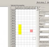
Is it possible in the Time blocks to put an option that the squares can be colored? Something like Alt+Mouse click to open a simple color option.
Why? On our radio ads are placed a few days in advance. E.g. so can the radio host indicate to the marketing manager that there will be a show at a certain time to not put ads then. Or e.g. to place certain ads in that time.
 
Last edited:
Can you add a Delete Button in the Ads Scheduler as it was before. So I don't have to open Edit, then select the Ad, then Delete and then OK. Lots of clicks to just delete the ad.
There's the Delete button under the ads list in the main window - you can use it to delete the ads. You can also press the "Delete" key on the keyboard.

Is it possible in the Time blocks to put an option that the squares can be colored? Something like Alt+Mouse click to open a simple color option.
Why? On our radio ads are placed a few days in advance. E.g. so can the radio host indicate to the marketing manager that there will be a show at a certain time to not put ads then. Or e.g. to place certain ads in that time.
Do you mean color the blocks in the grid in general, so what you edit ads, you always see those colors?
 
There's the Delete button under the ads list in the main window - you can use it to delete the ads. You can also press the "Delete" key on the keyboard.
Sorry, I'm used that the Delete is where the Edit is now so I didn't see it on the right side :cool:

Colors like this in the picture. So I can indicate which blocks are occupied (e.g. some show). So the marketing manager doesn’t put up ads in this time.
 

Attachments

  • 2021-12-03_114847.jpg
    2021-12-03_114847.jpg
    38.2 KB · Views: 268
Colors like this in the picture. So I can indicate which blocks are occupied (e.g. some show). So the marketing manager doesn’t put up ads in this time.
Noted for the future versions, thank you for the suggestion.
 
In Ads Scheduler, when using the multi track rotation, the colour changes to red if there is an issue with one of the files within the tracks selection. However it doesn't highlight which track is the issue, so you need to go through 1 at a time.

it would be good if there was some kind of indicator within the Ad Properties to signify which track is causing the issue.

1638805353649.png
 
Having the Ads Scheduler be resizable would be nice. The scheduled items listed on the right side only show a small amount of space. It would be good if we could adjust the window so the columns on the left could be shrunk temporarily while we look at what's scheduled on the right side (basically, click and drag the window across similar to how we can do that for the workzones in regular RadioBOSS).

I've highlighted a couple of 'grab' areas in red that would be natural places to add the ability to click and drag the window, to make the schedule box wider.

1639039318897.png
 
The central part with grid has fixed size. We can make it proportional so when a window is resized, both Ads list and the right part are increased in size. What do you think?
 
Back
Top