RadioBOSS 6.1 Ads Scheduler

tomimatko

Active member
Ad Scheduler
- Is it possible to retain the old view? If we cycle through our list of files to quickly scan for priorities/start/finish dates, we now have to click into each file one by one to get that information instead of pressing the down arrow in the list and making sure everything is configured the way we want. If priorities are used (which we use), the new view doesn't show this information easily.
I agree with him. The new view is more complex and not easy to use. If there a lot of ads can not easily get information. In previous versions Radioboss automatically took the name, and now I have to type in every ad.
The old look was perfect. Easy to use and preview ads.
Please bring it back :cool:
Or at least put an option that people can choose how to add ads?
 
Last edited:
Ad Scheduler
- Is it possible to retain the old view? If we cycle through our list of files to quickly scan for priorities/start/finish dates, we now have to click into each file one by one to get that information instead of pressing the down arrow in the list and making sure everything is configured the way we want. If priorities are used (which we use), the new view doesn't show this information easily
I'm afraid that wouldn't be possible. The old design had a major flaw, specifically, too little space for ad parameters. We can extend the list to include some of the parameters (add new columns) - I guess we'll need to collect some feedback first on what information should be included there.

I agree with him. The new view is more complex and not easy to use. If there a lot of ads can not easily get information. In previous versions Radioboss automatically took the name, and now I have to type in every ad.
A name can be auto-generated form the first audio file you add, this will be in the next update.
About easiness of getting the information, the table can be extended to include more info, like I wrote above. What information do you like to see there?
Old UI even as an option is not possible, it's just not worth it, maintaining two different UI sets it way too time consuming.
 
I'm afraid that wouldn't be possible. The old design had a major flaw, specifically, too little space for ad parameters. We can extend the list to include some of the parameters (add new columns) - I guess we'll need to collect some feedback first on what information should be included there.


A name can be auto-generated form the first audio file you add, this will be in the next update.
About easiness of getting the information, the table can be extended to include more info, like I wrote above. What information do you like to see there?
Old UI even as an option is not possible, it's just not worth it, maintaining two different UI sets it way too time consuming.
It's exactly what I had in mind.
Columns to see the start and end date. y Autogenerate the name of the commercial with the file name (When it is empty)
 
Maybe a column with number of alternate tracks? Since multiple adds can be added under one name. Or a column with a sign that inform there is several tracks.
 
I'm afraid that wouldn't be possible. The old design had a major flaw, specifically, too little space for ad parameters.

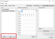
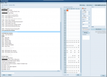
@djsoft I have attached a screenshot of our active ads scheduler in version 6.0.6.2 (old / current view) so you get an idea of how we're currently operating it.

CSA Adhoc Active are just 1 off community service announcements. CSA Community Auto Rotation and CSA Health Auto Rotation cycle through a list of tracks (under Alternate tracks > Manage) and the rest shown are single files scheduled at particular times. We have different prioritisation for different file types (Sponsor = 2, CSA = 3 etc.)

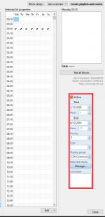
I've also attached the new view as well, with a modification. I've highlighted with a red box, where the functionality (start / end / priority etc.) could move to. You would retain the existing functionality - and potentially expand the text boxes a little wider. That should solve the issue of not having enough space for scheduling (maybe a scrollable window for smaller screens, if that is a concern).
 

Attachments

  • current_view.png
    current_view.png
    103.8 KB · Views: 345
  • new_view.png
    new_view.png
    40.2 KB · Views: 342
Bug - when the ads scheduler is shrunk down to as low as it goes, the Delete button hides behind the Add and Edit buttons
 

Attachments

  • ads_scheduler_shrink.png
    ads_scheduler_shrink.png
    22 KB · Views: 285
I have attached a screenshot of our active ads scheduler in version 6.0.6.2 (old / current view) so you get an idea of how we're currently operating it.
I absolutely agree with southernfm!!
I think the main idea for Radioboss is to be user friendly which is not the case now with this.
Anyone who works with a lot of commercials knows what we’re talking about. Eg. before, I could select several ads at once and they would all be imported. Now I have to one by one...
You've unnecessarily complicated things. And I don't see it as an improvement but a step back.
This solution he suggested in the picture would be great. So there is enough room for that in the right part. The suggestion from southernfm along with your idea with columns would be perfect.
I guess you spent a lot of time doing it this way, but unfortunately you didn’t hit the point. When you already have such a large community who are ready to help, maybe in the future, when you make some big changes, ask people before that for their opinion.

No need to complicate things like Jazler or SAM Broadcaster. The idea should be that it is easy to handle but extremely effective.
 
I've also attached the new view as well, with a modification. I've highlighted with a red box, where the functionality (start / end / priority etc.) could move to. You would retain the existing functionality - and potentially expand the text boxes a little wider. That should solve the issue of not having enough space for scheduling (maybe a scrollable window for smaller screens, if that is a concern).
This information can be placed directly into the ads table - even on your screenshot there's large unused white area that can be populated with data. This allows a better overview of things and also adds table-related features like sorting and filtering. Placing those controls directly into the window will make it appear cluttered.

Old design makes it hard to add any new options for ads because there's very little screen space. The old design, while useful in the past, already served its purpose and it's time to move on.

Anyone who works with a lot of commercials knows what we’re talking about. Eg. before, I could select several ads at once and they would all be imported. Now I have to one by one...
Multi importing is possible to implement here too, but we need to ensure there's demand for it. How often do you need to add multiple ads at once?

You've unnecessarily complicated things. And I don't see it as an improvement but a step back.
Editing ads parameters in a small area on the right was good once, but after adding all those additional options, this became really ugly. Lots of controls are placed densely in a narrow area. You already see the inadequately small "Comment" field and "Alternate tracks" moved to external window - this really looks like a temporary workaround (and in fact, it is).

When you already have such a large community who are ready to help, maybe in the future, when you make some big changes, ask people before that for their opinion.
Currently it works like everything else in RadioBOSS e.g. event scheduler where you have a list and edit each item in a separate window. So the pattern is familiar and should be accepted without any new things to learn. I wouldn't consider this as breaking change, also some modifications will be made based on discussion in this topic.
 
This information can be placed directly into the ads table - even on your screenshot there's large unused white area that can be populated with data. This allows a better overview of things and also adds table-related features like sorting and filtering. Placing those controls directly into the window will make it appear cluttered.
Key thing is that the info is on the main screen rather than a sub menu. The info coming up in columns should be okay.
 
Hello. At first I wanted to congratulate you on the new “Ads Scheduler”, I find it much more attractive than the previous one. It has been a great success.
There is always some, but ...
I don't know what exactly “Profile” is for. If I activate a new "Profile" I must configure everything from the beginning including the advertisements. Wouldn't it be easier if the necessary ads could be imported or cloned since I have everything configured in another "Profile" for example <<default>>? This could be useful, for example, to reconfigure the advertising blocks at certain times of the year, for example, Christmas, and to be able to schedule the advertising every 15 minutes instead of every 20 minutes.

As for the sale of "Ad properties", it is quite complete, although I would add something so that, in the tracks, you can choose the repetitions of these tracks. That is, there are customers who want something like this: 5 ads a day = 2 ads + 2 ads + 1 ad. I do not know if I explain well what I mean. In this window you could enter the option to clone ad to another "Profile".

As for the separators, for me they would make sense if every X advertisements could be placed. Do not cut after cut and with percentage probability.

I also miss "Add Blocks" that you can choose the hours and minutes independently. That is 7:10, 7:40, and then 8:00, 8:15, 8:30 ...
 
OK, we'll see what other users have to say about this.
We do batch imports a fair bit, when we have an intake of Sponsors, a batch of Adhoc announcements, or to schedule in pre-records at the moment with covid. Heavier than it used to be pre-covid.
 
I don't know what exactly “Profile” is for. If I activate a new "Profile" I must configure everything from the beginning including the advertisements.
Yes, this is the point. You can have the ads that are totally different - commercial ads, political, social etc. Each set is configured independently, has its own intros and other rules.

This could be useful, for example, to reconfigure the advertising blocks at certain times of the year, for example, Christmas, and to be able to schedule the advertising every 15 minutes instead of every 20 minutes.
That'd be very difficult because it has different grids/blocks, and converting from one to another is almost impossible to do properly. E.g. if original block had ad scheduled at 15:15, but the new profile doesn't have suck slot.

For new year or other special times of year you can use the "Grid presets" instead where you can save/load grids for ads, this allows quickly changing when the ad will run.

in the tracks, you can choose the repetitions of these tracks. That is, there are customers who want something like this: 5 ads a day = 2 ads + 2 ads + 1 ad.
In this case, those ads can be scheduled as separate items. This would be easier.

As for the separators, for me they would make sense if every X advertisements could be placed. Do not cut after cut and with percentage probability.
Probability option already presents in the new Ads Scheduler.

I also miss "Add Blocks" that you can choose the hours and minutes independently. That is 7:10, 7:40, and then 8:00, 8:15, 8:30 ...
Yes, we have this feature planned for the future but I'm not sure at this moment when or if it's going to be implemented. I agree in the current implementation it will have lots of unused slots if you need different minutes for hours and the grid is bigger than it should.
 
And independently days....
Do you have different hours/minutes for days? Can you please provide an example of the blocks you have?

Key thing is that the info is on the main screen rather than a sub menu. The info coming up in columns should be okay.
Yes, it will be on the main screen. An updated beta version with extended ads list should be released today.
 
Back
Top