Some requests for future updates

As for hiding icons/allowing user icon sets, I'm not sure. Do you want to only change the track icons?
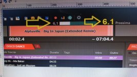
This option is the one we currently use but it is not fully configurable. The main objective is to establish an icon for each element that is in the PL. Either by the user or by radioboss.
Any of these options can work for me.
 
Please, could we set up the same icons (icon library) in the tabs of the other work areas? In addition to collapsing the tabs according to their content? In this case, the icons, this saves us a lot of space.

1740229647500.png
 
Please, could we set up the same icons (icon library) in the tabs of the other work areas? In addition to collapsing the tabs according to their content? In this case, the icons, this saves us a lot of space.
How many tabs do you have in the additional work zone? You can try using the Emoji symbols as tab names, those will appear as icons.
 
How many tabs do you have in the additional work zone? You can try using the Emoji symbols as tab names, those will appear as icons.
That's exactly what I'm using. You can see it in the screenshot, but those emojis are old and not as clear as the icons on the left side of the screenshot. That's why it would be nice to have the option to adapt the tab to the content size and update the icons... in the additional window about 15/16 tabs are used. but there are those who only use one screen and to save space this would be a good implementation.
 
That's why it would be nice to have the option to adapt the tab to the content size and update the icons... in the additional window about 15/16 tabs are used. but there are those who only use one screen and to save space this would be a good implementation.
Using the icons will not really add any space. No matter text or icons, it will still fit all the tabs and tabs will have their size calculated so all they fit on screen.
We'll make a small adjustment, to make it paint the emojis in color, not black as it is now. Hope this helps.
 
Using the icons will not really add any space. No matter text or icons, it will still fit all the tabs and tabs will have their size calculated so all they fit on screen.
We'll make a small adjustment, to make it paint the emojis in color, not black as it is now. Hope this helps.
In my case if you add spaces when using icons. It looks like in the screenshot
1740478360056.png

If this gets fixed, that would be great.
 
Can you please specify what is wrong there?
I put an icon as the tab name, which has no spaces added. But it looks like the tab is long (with space) and does not fit the size of the icon set, as in the other work area. I mean it should look the same in all work areas.
 
I put an icon as the tab name, which has no spaces added. But it looks like the tab is long (with space) and does not fit the size of the icon set, as in the other work area. I mean it should look the same in all work areas.
The icons (emojis) are drawn as text. The text is positioned/centered based on the tab dimensions. RadioBOSS doesn't do anything special for emojis.
 
Cosa vorrei avere su radioboss
Quando inizia l'intro, appare il conto alla rovescia numerico e una barra verde/blu. Questa barra potrebbe essere utile a qualcuno, ma ciò che è molto importante per noi è il numero del conto alla rovescia in una dimensione più grande, molto più grande perché a quanto pare è decisamente troppo piccolo. Ps: speriamo che questa traduzione sia il più fedele possibile, il fatto di non poter scrivere in italiano ma usare la traduzione è un altro problema.
What I would like to have on radioboss
When the intro starts, the numerical countdown appears and a green/blue bar. This bar could be useful to someone, but what is very important for us is the countdown number in a larger size, much larger because apparently it is definitely too small. Ps: let's hope this translation is as faithful as possible, the fact of not being able to write in Italian but using the translation is another problem.
 
This bar could be useful to someone, but what is very important for us is the countdown number in a larger size, much larger because apparently it is definitely too small.
Can you please provide a modified screenshot of how you want it to look like? Currently it uses a large font like 24pt and making it bigger will look ugly and very specific. Maybe we'll add an option to control it but I'm not sure yet about it.
 
Puoi per favore fornire uno screenshot modificato di come vuoi che appaia? Attualmente usa un font grande come 24pt e ingrandirlo sembrerà brutto e molto specifico. Forse aggiungeremo un'opzione per controllarlo ma non ne sono ancora sicuro.
 

Attachments

  • 1741459141601.jpg
    1741459141601.jpg
    220.1 KB · Views: 17
It's bigger than any other fonts on the screen, is it really necessary? In the future we'll be probably adding a font setting for this item, so you can adjust it.
 
It's bigger than any other fonts on the screen, is it really necessary? In the future we'll be probably adding a font setting for this item, so you can adjust it.
For me and my colleagues it is necessary. Maybe in the future we can insert an option to increase the size etc. etc. of the font. Regards
 
Back
Top