RadioBOSS 7.0 [beta]

Status
Not open for further replies.
Currently its font becomes larger and it's also made bold. Active cells look a lot darker than thin small numbers where ad is not in the block. The font size difference can be made even larger, but I think we should wait and see what others have to say about it.
Making it red doesn't seem right - red usually means there's an error or some problem.
We have a lot of blocks, and almost all of them have numbers, so bold is not very noticeable. Perhaps, alongside bold, the field colors could also be changed?
 
One more thing about the video section, if it can be improved, the mouse pointer is visible all the time on the screen during playback, even when full screen playback is on, which is a bit annoying and makes no sense to me, unless it is hidden and appears at the end of the double click.
 
We have a lot of blocks, and almost all of them have numbers, so bold is not very noticeable. Perhaps, alongside bold, the field colors could also be changed?
Just like tomimatko we have many blocks too. I understand that red is synonymous with error, but green is synonymous with ok!...or, maybe we could choose the color.
I keep insisting that having the option to calculate the total time of the block would be interesting and as Tomimatko said we could choose the option to see quantity or time or nothing!
Maybe you can think of a new routine with better performance to calculate time.
 
The analysis report (based on which it paints the chart) can be exported (e.g. to a CSV), it will show for the whole day what events start when. Do you think we should add it?
This idea of this new function was a very good thing, but I don't think the graphic is the most appropriate.
The way it is currently being graphed is not very intuitive. It is curious to wonder why the bars have different heights, now I understand it, but without documentation it is impossible to know.
Another thing here is that there are events that are 3-minute files and here they are graphed with a width of the entire day. Maybe this is a bug.
In my opinion, a view like ADSOverview is what I need with this. (with a group filter and a single scroll that can compare all the events of the week hour by hour) Exporting to csv would not be necessary if the view is clear.

1700509405310.png
 
Last edited:
In the priority rules, if you could set hours ago (in addition to days), for the last playback. It would be useful for categories with high turnover.
 
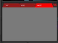
Hello, when you add a cart in this area it looks like this
Doesn't seem to reproduce here. Did you change the cart wall size or do any other modifications?

Approximately every 4 or 5 minutes the error window appears and just click OK and you can continue working.
This is odd, as all the work is performed in the background. We'll check it further.

I'm assuming this mode is included in the Advanced Options.
There are no accessibility options that need to be enabled from the Advanced Settings. You can enable text VST UI from View->Accessibility (Screen Reader) - it's now a submenu -> it will show you an option for VST.
 
We have a lot of blocks, and almost all of them have numbers, so bold is not very noticeable. Perhaps, alongside bold, the field colors could also be changed?
Yes, I think this will look better.

One more thing about the video section, if it can be improved, the mouse pointer is visible all the time on the screen during playback, even when full screen playback is on, which is a bit annoying and makes no sense to me, unless it is hidden and appears at the end of the double click.
It should be hidden, by default it's hidden automatically on playback and also after two seconds when mouse was moved. Maybe there's some bug, we'll check it, thank you.
 
Just like tomimatko we have many blocks too. I understand that red is synonymous with error, but green is synonymous with ok!...or, maybe we could choose the color.
I don't think it needs to be configurable. Visibility will be improved in the next update, the plan is to make it work good by default.

I keep insisting that having the option to calculate the total time of the block would be interesting and as Tomimatko said we could choose the option to see quantity or time or nothing!
Did you try the Test all blocks feature? If the point is to identify blocks that are too long, this will do. Showing time in the grid has multiple problems: performance (time required to calculate duration) and screen space (meaning grid needs to be redesigned).
 
This idea of this new function was a very good thing, but I don't think the graphic is the most appropriate.
This is to show an overview of what's starting. Height doesn't mean anything, its purpose is to prevent events hiding each other.

In my opinion, a view like ADSOverview is what I need with this. (with a group filter and a single scroll that can compare all the events of the week hour by hour)
A test version of this will be added in the next update I think.

Another thing here is that there are events that are 3-minute files and here they are graphed with a width of the entire day.
Can you please show a screenshot of such an event? You can double-click in the graph and event editor window will open. Currently it checks duration if it's a playlist or a single track, if it's a command or something complex, it just sets the duration as 10 minutes.

In the priority rules, if you could set hours ago (in addition to days), for the last playback. It would be useful for categories with high turnover.
It can be improved to accept fractional values, like 0.5 (half the day) - 12 hours, will this work?
 
Can you please show a screenshot of such an event? You can double-click in the graph and event editor window will open. Currently it checks duration if it's a playlist or a single track, if it's a command or something complex, it just sets the duration as 10 minutes.
This is my test PC, it has nothing to do with the previous screenshot. But it is an example of the same graph that takes up all day

1700552827822.png
 
That's great, thank you!
Just in case, this follows from this. I have to replicate this grid, (Now it is possible more easily with day of the week for each hour)
This is something tedious that I do not make changes frequently but it would be a great help to avoid making mistakes in the schedules and assignments of the PLGen preset

 
Please click Settings, Open Settings Folder, open Logs and send us databaselog.txt file, maybe it'll contain some info that will help.
[2023-11-20 09:40:13] [FireDAC][Comp][Clnt]-505. Connection [FDConn: TFDConnection] must be active
[2023-11-20 09:40:42] [FireDAC][Comp][Clnt]-505. Connection [FDConn: TFDConnection] must be active
[2023-11-20 09:41:12] [FireDAC][Comp][Clnt]-505. Connection [FDConn: TFDConnection] must be active
[2023-11-20 09:41:42] [FireDAC][Comp][Clnt]-505. Connection [FDConn: TFDConnection] must be active
[2023-11-20 09:42:13] [FireDAC][Comp][Clnt]-505. Connection [FDConn: TFDConnection] must be active
[2023-11-20 09:42:43] [FireDAC][Comp][Clnt]-505. Connection [FDConn: TFDConnection] must be active
[2023-11-20 09:42:45] [FireDAC][Comp][Clnt]-505. Connection [FDConn: TFDConnection] must be active
[2023-11-20 09:43:13] [FireDAC][Comp][Clnt]-505. Connection [FDConn: TFDConnection] must be active
[2023-11-20 09:43:15] [FireDAC][Comp][Clnt]-505. Connection [FDConn: TFDConnection] must be active
[2023-11-20 09:43:43] [FireDAC][Comp][Clnt]-505. Connection [FDConn: TFDConnection] must be active
[2023-11-20 09:44:13] [FireDAC][Comp][Clnt]-505. Connection [FDConn: TFDConnection] must be active
[2023-11-20 09:44:42] [FireDAC][Comp][Clnt]-505. Connection [FDConn: TFDConnection] must be active
[2023-11-20 09:44:57] [FireDAC][Comp][Clnt]-505. Connection [FDConn: TFDConnection] must be active
[2023-11-21 20:04:49] [FireDAC][Comp][Clnt]-505. Connection [FDConn: TFDConnection] must be active
[2023-11-21 20:05:19] [FireDAC][Comp][Clnt]-505. Connection [FDConn: TFDConnection] must be active
[2023-11-21 20:05:49] [FireDAC][Comp][Clnt]-505. Connection [FDConn: TFDConnection] must be active
[2023-11-21 20:06:19] [FireDAC][Comp][Clnt]-505. Connection [FDConn: TFDConnection] must be active
1700557639770.png
 
Doesn't seem to reproduce here. Did you change the cart wall size or do any other modifications?
I have the same problem. I didn't change the size of the carts and I didn't make any other changes. (Radioboss 32 bit)
 
Last edited by a moderator:
This is my test PC, it has nothing to do with the previous screenshot. But it is an example of the same graph that takes up all day
Thank you, looks like there's a bug.

I like to use cascading priority rules, going down to the last hour.
As long as you can enter values like 0.0416 it would be perfect. :)
OK, the next update will allow doing that.

This is something tedious that I do not make changes frequently but it would be a great help to avoid making mistakes in the schedules and assignments of the PLGen preset
I don't seem to understand this one - can you please provide more information about it?
 
[2023-11-20 09:40:13] [FireDAC][Comp][Clnt]-505. Connection [FDConn: TFDConnection] must be active
Interesting; we can't reproduce it here, both x32 and x64 RadioBOSS are able to connect and work with latest MySQL (community version). Please send your configuration file (my.ini) from C:\ProgramData\MySQL\MySQL Server 8.0 - we'll test it here with the same server settings.
 
Doesn't seem to reproduce here. Did you change the cart wall size or do any other modifications?
No, but when I change the size it works normally.
Also when I change the profile it looks normal.
But it only happens when added in dark mode
 
Status
Not open for further replies.
Back
Top